Renowned British artist and film director, Nick Egan, shares the genesis of his creation of his most unforgettable album covers spanning 1988 to 2015.
Lullaby – Book of Love (1988)
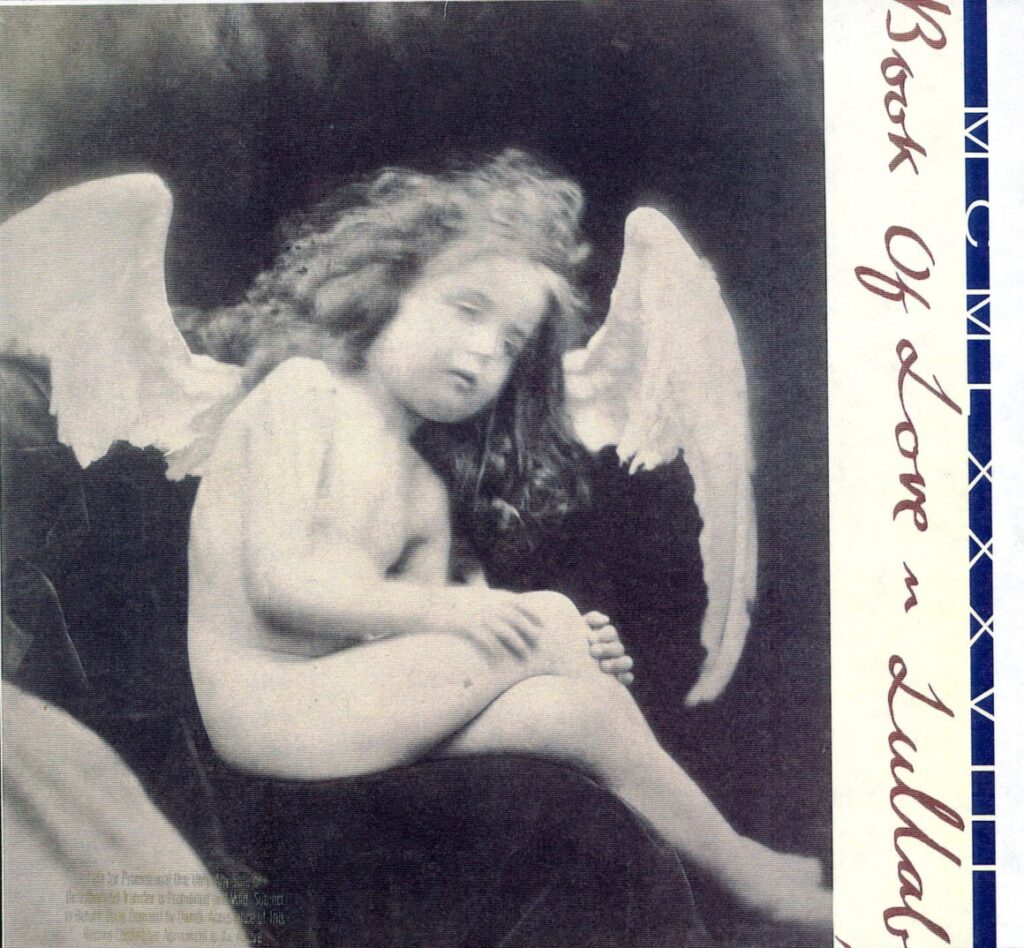
This was the second cover I did for the group. Art schools in England are very different from art schools here in the US mainly because, with the exception of a few like Parsons, Rhode Island and Cal Arts. In London there are 15 in London alone. Most art schools in the US are part of a large university so their identity is buried within the general university. Art schools in the UK are an entity of their own away from general academia, left to their own devices because academia doesn’t know how to handle them , so the students are given a great deal of autonomy, which why some of the greatest and most influential bands have come out of UK Art Schools: John Lennon, Keith Richards, David Bowie, Pink Floyd, Sex Pistols, The Clash, Malcolm McLaren, Roxy Music, Blur to name a few.
Book of Love came through the School of Visual Arts on the East Coast. Their aesthetic is more British than American which is why I related to them, they had a hold on all sides of creativity down to the colour of the laces in their shoes. They knew their look the moment I met them, which I loved. People think I waltz in and give everyone orders “do it like this” “do it like that” and that is the case sometimes but it’s much harder work. So when a band comes along and knows exactly what they are aiming for, I love it. It’s inspirational to me and I have such respect for any band who knows who they are and what their influences are. For this cover they wanted to use an image of British Victorian photographer Julia Margaret Cameron. She broke down societal norms in an era that was dominated by men. If you were a female author back in Victorian England chances are you would use a male first name to get published. Book of Love were ahead of their time in regards to gender equality, gay rights in a period where it wasn’t always safe to be gay or bi. Susan’s lyrics remind me of DH Lawrence where he used metaphors to cover sexuality. Unfortunately now, you are bludgeoned with political correctness. Book of Love would bring awareness through art, they would tell the story and have you decide what was right and what wrong, how beautiful is that?
Fruit at the Bottom – Wendy and Lisa (1989)
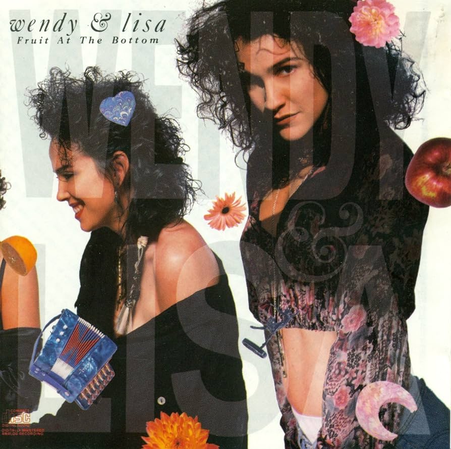
This continued in a series of high contrast stylized against white background covers and that look defined a look of the 90’s with stylish pages of Vogue and the Calvin Allen men’s underwear ads and the photography of Nick Knight and ID Magazine. I introduced it into the rock’n’roll genre but even then I was cautious which groups I worked with and now more than ever musicians were becoming a part of the society of the spectacle. Rarely did rock’n’roll and high fashion become intertwined and even then it was a hierarchy, bands who dated models and led a decadent lifestyle or bands who had street cred. For example, it would never work with a band like Men at Work, but it did with INXS. Neither would it work with Katrina and the Waves, but it did with the Furs. J Geils Band – NO, Iggy Pop – YES, you get the picture, by its very nature multi million selling artists are elitist as the regular public could never afford the luxuries and there’s nothing wrong with this.
Generally the public love stars, they don’t want them to be the same. One of Michael’s great qualities was his humbleness (it’s an Aussie thing) he would stand in line at a club and I told him it’s OK to be a star sometimes to get the benefits. I would take him to the front of the line and say “I’m here with Michael Hutchence from INXS” and he was instantly ushered into the club with people making sure he had everything. Wendy and Lisa had that same star quality but they knew when to use it or not. After all they came from the Kingdom of Prince and along with Madonna and Michael Jackson you couldn’t get a higher status than those three. I had just arrived in LA when I was told Wendy and Lisa wanted to meet me about an album cover and video. Because I’d been in Australia for a year I was an unknown quality and again I knew management wanted someone else, but the girls stood their ground and I will be eternally grateful to them.
Sonic Temple – The Cult (1989)
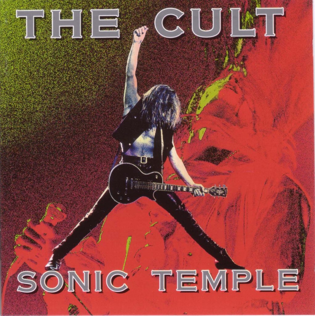
They are one of the all time great rock’n’roll bands, up there with The Clash and INXS live. Ian is one of the most genuine people I’ve met but he can turn on the rock star in an instant. Billy is the perfect partner in that great tradition of singers and guitarists, guitar slung low on this thigh. Ian would be a talented designer in his own right, he understands the medium better than any other artist. He was there all the way from start to finish which again I embraced, the connection was real and immediate. There is a certain amount of passive aggressiveness in the record industry where a band will tell you to your face “oh yeah, it’s great man” but then go to their manager and say the opposite, I hate that it’s such a waste of time, dancing around trying to get an honest answer.
Andrew McPherson was the photographer who is one of the best fashion photographers of the 1990’s to 2000’s. I was concerned that he wasn’t right for this cover as I wanted something rock’n’roll. When I got to the set the first thing I told him was I was going to fuck his photos up to the point you would recognize them. What I loved about Andrew was he looked at me and said “Great! Do whatever you want to them” . I couldn’t name another photographer, that if you told them that, would have responded that way. Andrew is one of the great contemporary photographers and I love his work. His U2 shots are brilliant but I wanted the cover tripped out almost psychedelic. Like ‘She Sells Sanctuary’ but also rock star like those old Jefferson Airplane and Jimi Hendrix posters but again with a contemporary edge. I worked at Electric Pencil with Ian sitting there, literally making it up as I went along, experimenting with filters until I would hear Ian say ‘Wow’ or ‘Cook’ and work from there. Initially there was concern that you only saw Billy. Again I told people it was an iconic pose to look at it as a cover, not as a record label or management, people would gradually notice it was Ian in the background. People love that kind of discovery because it makes them connected. I have to say when they did the anniversary edition, Ian did a brilliant job on the cover.
World Clique – Deee-Lite (1990)
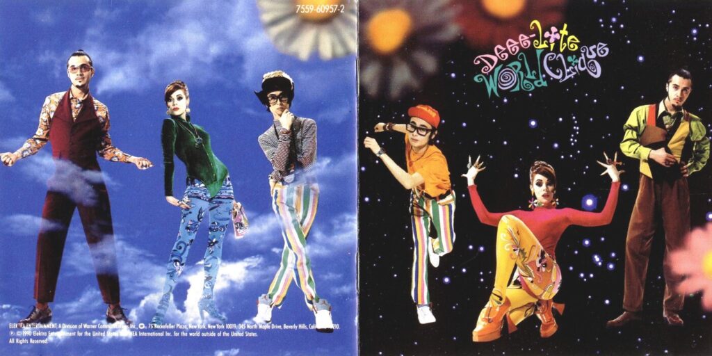
I received a very long and detailed letter from Kier, expressing how much she wanted to work with me. Sadly I lost this letter somewhere along the way. In it she not only told me how much she admired my work, but she went into extreme detail about how she saw the look of the cover, pointing out different aspects of my work and how it fit in with her ideas. Again she was another artist who had many references and wanted to know if could create something from what she told me.
She was such a larger than life character, almost cartoonish as were her two sidekicks, a hip downtown version of the Jetsons. They were both retro and futuristic. At this point I was working digitally with a company in LA called Electric Pencil, so I knew I could go anywhere I wanted with the artwork. I also continued to play with the concept front and back, which were interchangeable. Michael Halsband again shot the photos and a friend of Kier’s did the lettering.
Live Your Life Be Free – Belinda Carlisle (1991)
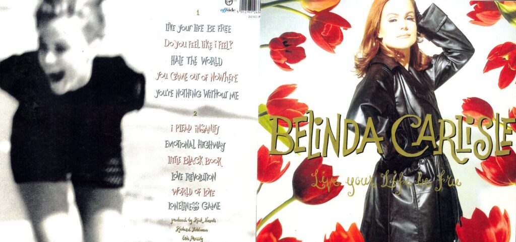
Belinda is a star in the old fashioned sense, like a movie star from the 50’s. In those days stars were more about a person’s aura the ability to turn heads wherever they went, Hollywood magic. Belinda is LA punk version of Marilyn Monroe, Rita Hayworth, Grace Kelly and Kim Novak and only Belinda could carry off that vintage Hollywood style. It wasn’t just in the way she dressed but how the camera loves her. People’s heads turn even if they don’t know who she is. With the cover I wanted to pay tribute to that. With the INXS X album I brought New York photographer Michael Halsband to Australia.
With Belinda’s record I brought Sydney photographer Grant Matthews to LA. I worked with Grant on Kick and Max Q. Grant is one Australia’s top fashion photographers and I thought he would be great for Belinda rather than the merry go round of US beauty photographers. It’s also when I met one of my best friends Jeannine Braden, who is also Belinda’s stylist and close friend. Jeannine went on to don nearly every video or photo shoot I did, not just because of her talent as a stylist but because we would laugh so much on the set, you’ve got to have fun! The late great Paul Starr did the make up. It was a time when I was split between album covers and videos and I knew it would be impossible to do both at times. I met a young graphic artist out of Cal Arts, Eric Roinestadt who had the perfect aesthetic to compliment mine. Pretty much all the graphic design on ‘Live Your Life Be Free’ was done by Eric. He was one of the people I worked with that I trusted 100%, so this album was the beginning of my glamour squad. It was first time I had a group of people who got on with it.
Duran Duran (AKA the Wedding Album) – Duran Duran (1993)
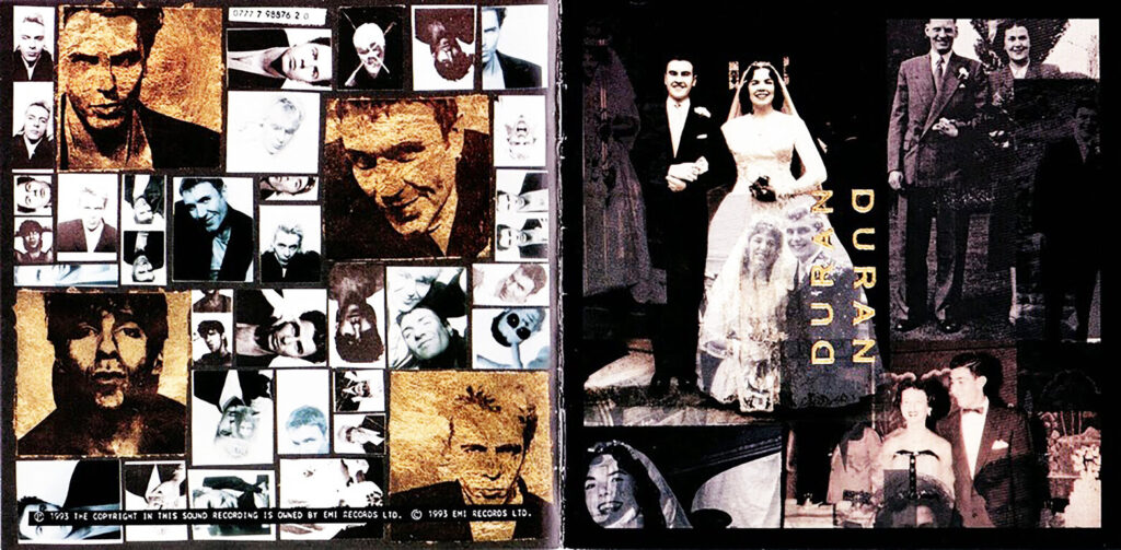
This was born out of a great working relationship with the band. A mutual friend told me John Taylor was looking for me to do the new Duran album cover. By chance I happened to be in London at the time, so initially I met John at his house there. It was one of those rare occasions where you hit it off straight away and John and I have been close friends ever since. It was John who introduced me to my wife, Ann. But the one thing you learn straight away, unlike INXS where there was only one star – Michael, in Duran there, at the time, there were three: John, Nick and Simon (now of course Roger has rejoined so there are four). All of them have great ideas but sometimes it’s hard deciding which one works best, sometimes it’s John, sometimes it’s Simon but mainly it’s Nick and then John takes over. Simon is more in the moment and his ideas come about on the day.
But the most amazing thing about the band and one of the reasons they’ve lasted for so long is that these strong individuals at some point merge into one entity. In this case Simon had the photo booth idea, Nick came up with their parents photos and John was more about the overall look. The concern was how to make a cool and edgy cover with wedding photos. To most people most wedding photos are kitsch and Duran are not kitsch. But they all have a great appreciation for art and it was made easier because we all grew up around the same time so we understand each other’s references. I got the main idea from the artist Robert Rauschenberg. Someone said to me recently that the Wedding Album cover was the greatest example of the punk ethic. I never thought of that but they are absolutely right.
Filthy Lucre Live – Sex Pistols (1996)
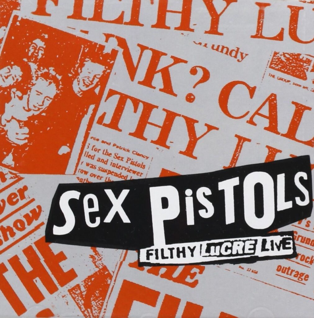
I’ve included this just because it’s the Sex Pistols and to have an officially release Sex Pistols album in my work is incredibly relevant. Seeing them the first time at the 100 Club in May 1976 changed my life. So when Steve and Paul asked me to design the cover I was thrilled. I even MC’d the press conference at the 100 Club for the 1996 comeback tour. I remember going to a rehearsal at a stage in Century City, where everything was set up, backdrop, back line everything, and when Jonesy started playing ‘Bodies’ it was like a weird dream. From this 19 year old art student, slightly awkward seeing the guys standing next to get up on stage was a defining moment. At that point, I was a fan just like everyone else, I never dreamed that I would be on this path. travelling at the speed of light, The Ramones. Richard Hell, The Clash, Bow Wow Wow, Malcolm McLaren, Iggy Pop, Bob Dylan, the Furs, INXS, Kylie Minogue, The Cult.and Duran Duran.
Most people would have been lucky to work with two of those artists. I often wonder if it was all a dream, especially because of that kid in 1976, none of this was even a possibility then. So if you told me then, I would have told you to fuck off. So to step back and go through all of this work is humbling and without sounding arrogant, all of that is true, influence seen by millions and millions of people as opposed to some poser who has too much time on his/her hands dreaming of fame without working for it. Fame was the last thing on my mind when I started. It was enough to get to work with some of the greatest artists of our generation. So the disappointing thing about this cover was that it was a distant 2nd choice. But we were unfortunate enough to work with a vice president (can’t mention names) who looked and acted like a t* r h* with power. Her and I did not get on at all and behind my back she completely changed the packaging to a rough I had made that was so far down the list. This person had no clue about punk, probably would have scared the shit out of her, her behaviour was disgraceful and to this day I can’t stand her, although the band share some of blame as they caved in before she left.
Sundown Heaven Town – Tim McGraw (2014)
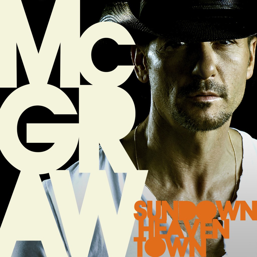
I’m sure this comes as a surprise to some of you, a country artist and not just any country artist, one of the biggest there is. I went on a trip to Nashville to see friends and see what was happening there, as a lot of LA based music people were moving there weren’t country. Jack White is based there as well as performers and writers from every genre. I was thinking on the journey how I’d never done a country album. There was one attempt with a girl called She Sheriff, the idea was great but the girl couldn’t pull it off personality wise but there was something unique and working class about country music that most American music doesn’t have. I love Patsy Cline. She was like a mom in a dress but she could make you cry. There was also Loretta Lynn, Tammy Wynette and the queen of them all, Dolly Parton, who sang about everyday things. I wasn’t into the men so much but you can’t leave out Johnny Cash or George Jones. I had remembered thinking there was something about Tim McGraw.
As it happened I was staying with my friends Harold and Shannon and I’d mentioned this and at the time Shannon was working at Creative Artists Agency who represented Tim and she told me he was rehearsing across the street at the arena. She set up a meeting with Tim and his Creative Director Kelly Clague and as soon as I met her it made sense why I thought there was something cool about Tim. She’s responsible for everything visual to do with Tim and the two of them have a great working relationship. By chance Tim had just finished his new album and they needed a cover quickly. They already had done the photo shoot and wanted to know if I would work with the photos. That was the first time in years I hadn’t art directed the photo shoot but I thought it would be a great challenge for me to incorporate my style with Tim and Kelly and give him that bold high contrast look I’d been doing with Iggy, INXS, the Furs etc. What I found interesting about Tim is he really puts a lot of effort into his art. He also loves most of the artists I’ve worked with, INXS and Duran Duran in particular. I was really happy how this turned out, bold and in your face, no ambiguity, this is who Tim is.
Damn Country Music – Tim McGraw (2015)
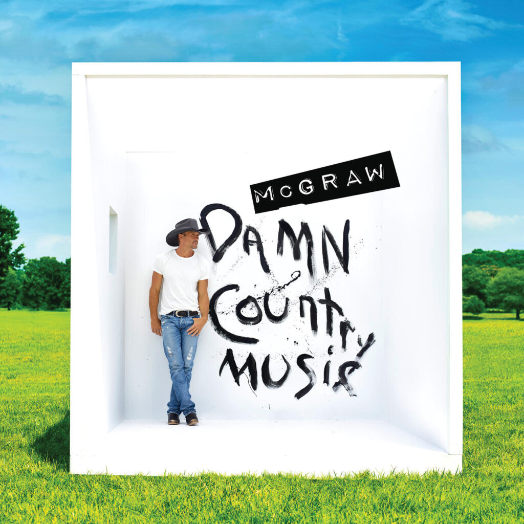
So here is my last cover of my favourites. It is important to me because it is the last album cover I designed. I like to think I give a band their look and not mine but there is a style that I’ve found works really well. Based on the fact that I was never a big fan of the band on the cover, I knew managers and record labels only wanted that if I had to come up with a way to re-invent that. Apart from my distaste towards a band on the cover you’re always faced with at least one member looking bad and you have to sacrifice them for the greater good, so I thought why not shoot each member individually and make sure everyone looks great and then assemble each band member into one shot then you have the flexibility of trying different sizes and angles in what looks like one shot.
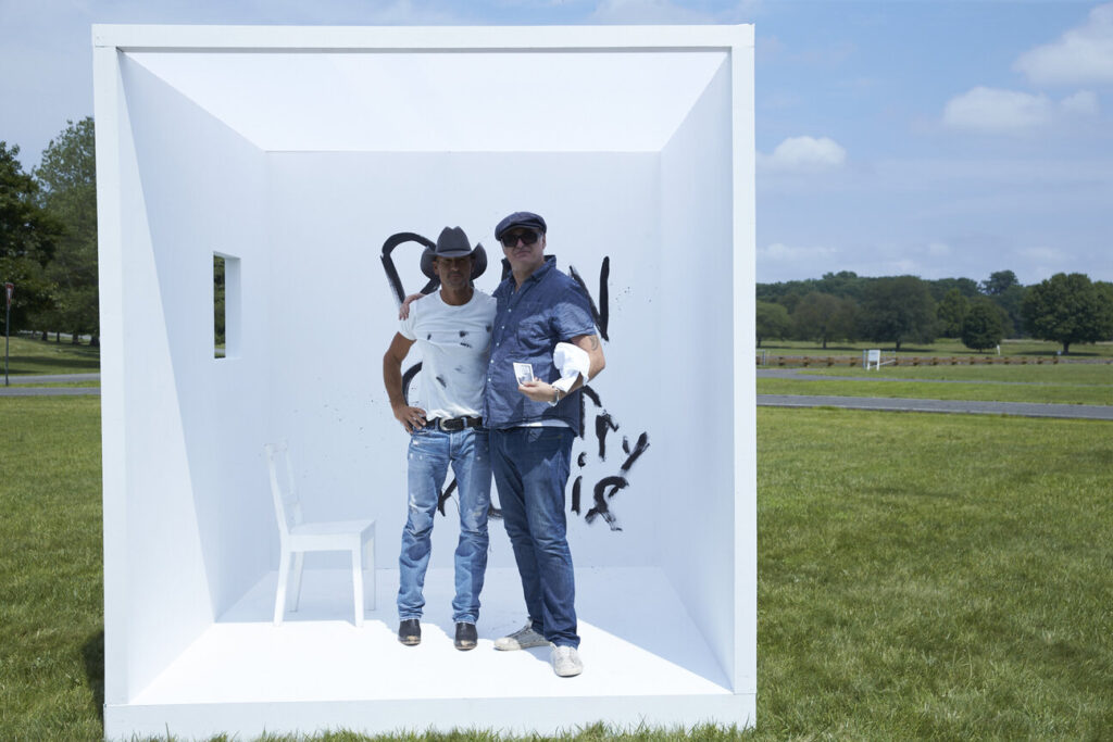
The reason to shoot against white on a simple blown out background means you don’t have to cut around each shape, I hate that, where it looks like it’s been cut out with scissors unless you want to go for that look. The one thing I learned from punk is everything is valid, there are no rules except for the ones you make yourself. So the final cover is like a reveal pulling back and revealing the environment and making people think or wonder if that’s how I did all of them. Like playing a trick into thinking it’s one photo but confuse it by making the perspective slightly off. I could quite easily line up INXS onto a blown out white cyc in one shot, but that isn’t as interesting or as flexible. So on each cover I’ve done something slightly different using that technique. If you look at that last photo it looks like you’ve put two photos together but it’s actually one. I love that kind of thing. This cover was probably the most expensive I’ve done. Just building that box was more than the entire budget on a regular cover but that is rare these days. Sadly the art of the record cover is lost. Nobody wants to take the time anymore and most artists can’t afford it anyway. You’re lucky if you get a budget of $2000. People are happy with a low resolution square. The whole point of an album cover was you had a relationship with it!
Further information
The Art of Sound: Nick Egan’s Album Covers Unveiled 1980-1987
The Art of Sound: Nick Egan on collaborating with Michael Hutchence