British artist and film director, Nick Egan, holds a unique status within popular culture, leaving an indelible mark over the last forty years. In a trilogy of features, Nick recounts the creative journey behind crafting some of the most unforgettable album covers in the history of music. In this first part, Nick guides us through the years 1980 to 1987.
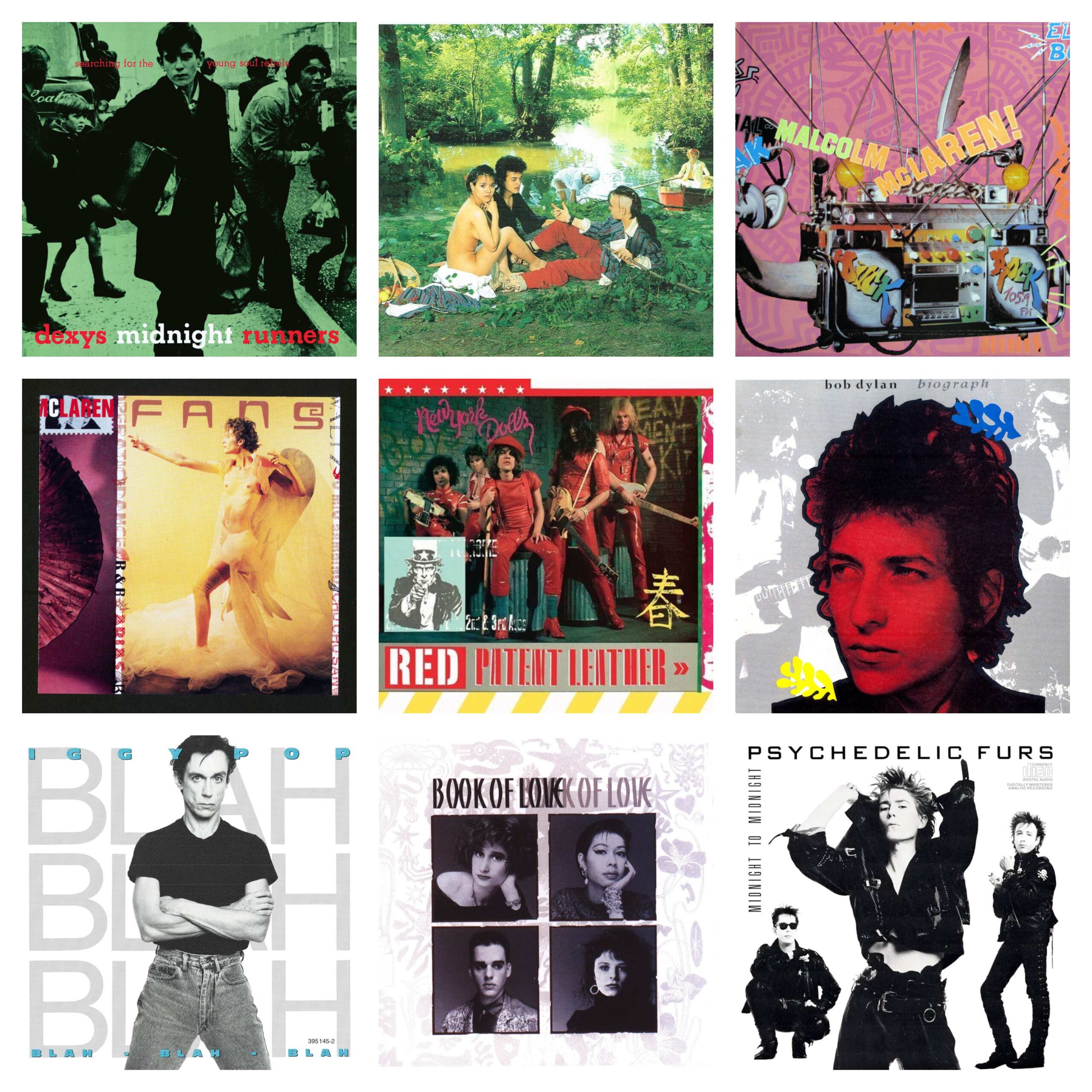
Searching For The Young Soul Rebels – Dexys Midnight Runners (1980)
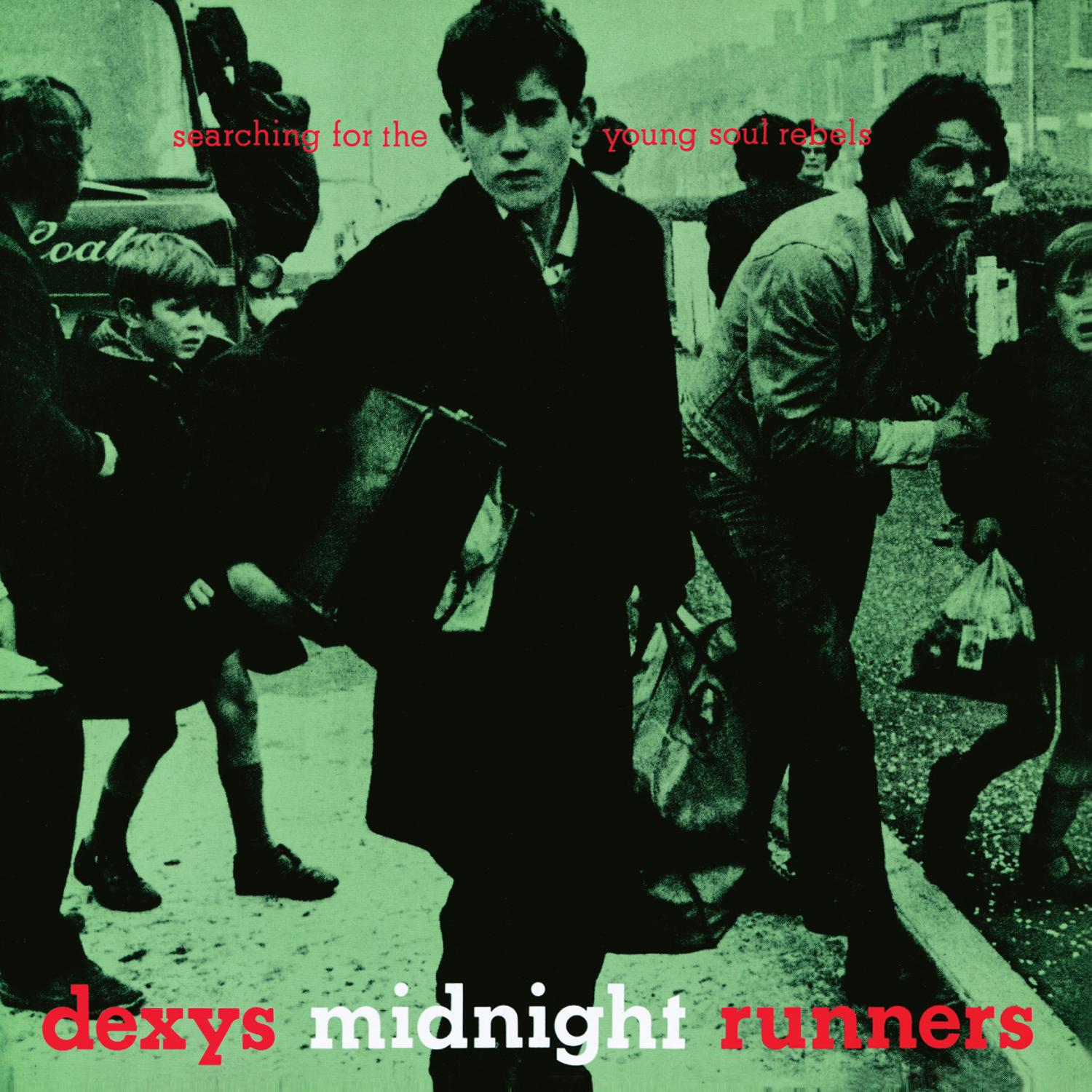
The very first, designed with my friend Pete Barrett, while only in our second year at Art School. We called ourselves Fly By Night Designs. We had no clue about copyright and we found this image in our Art School library tear sheets files. It was of a kid being evacuated in Northern Ireland during the troubles. With all the chaos around him, it’s powerful because he stares straight into the camera, not sure whether it’s friend or foe. Anyway this soon got headlines in Northern Ireland and we thought “Shit!” are we in trouble for not asking permission? Quite the opposite, both the Belfast Herald and the kid loved it. No chance of that happening now, there’d be demands of outrageous amounts of money. This is always in some top 10 album covers of all time and certainly was a great start.
See Jungle! See Jungle! Go Join Your Gang, Yeah! City All Over, Go Ape Crazy – Bow Wow Wow (1981)
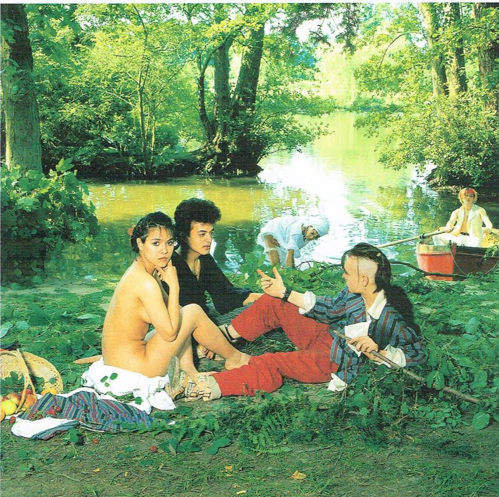
The second, the infamous Bow Wow Wow ‘See Jungle! See Jungle! Go Join Your Gang Yeah! City All Over! Go Ape Crazy!’ cover with Annabella naked in parody of Edouard Manat’s ‘Le déjeuner sur l’herbe (‘lunch on the grass’). This is always in top 5 ‘best ofs’ and was in Rolling Stones ‘Top 100 Album Covers of All Time’. So already I’ve got two classics and I’ve barely got off my chair.
People go on about the controversy this caused because Annabella was 15, but there wasn’t really, we’d just come out of Punk where there were far more shocking images. The fuss came from Annabella’s mum, who was more pissed off she didn’t get any money for it than anything untoward with Annabella, so she complained to the police and we had violated a minor naked in public place act. So there, apparently, was a warrant out for mine, Malcolm and photographer Andy Earl’s arrest. Luckily this was just days before Annabella’s 16th birthday on October 31st, so I flew out to Amsterdam, where Bow Wow Wow were playing, and got Annabella to sign an affidavit saying she fully cooperated with the session.
The idea of this photo being deviant in any way, never crossed our minds, but the media who are all pervs, created this myth. It was purely done for the art. However today this would be considered sexual and we probably would have been arrested. Which shows that we have got more and more conservative and people read whatever salacious thoughts they have and make a judgement on their own warped brains. Andy Earl, who was also just starting out, did a fantastic job in his creation from the Manet so we decided to go with the cover with no type at all, evoking the painting more. Believe it or not this caused more controversy than Annabella’s nakedness. They reluctantly agreed to the first run going out without type, but the moment the first run had run out they went back to their old unwritten rule, the band’s name and title must be at the top of the cover.
Duck Rock – Malcolm McLaren (1983)
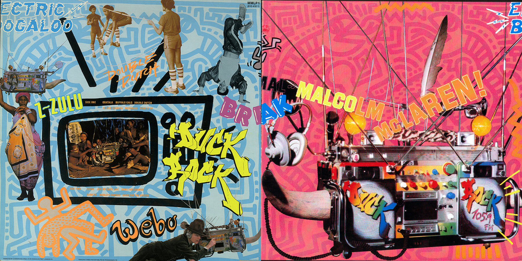
This cover and the previous cover are probably my most successful in terms of being on endless lists of best album covers. I always say this is the album cover that designed itself. My time spent in New York absorbing the vibrant new scene, which at that point didn’t even have a name and eventually became Hip Hop, there were very few people outside of the South Bronx knew anything about it. Malcolm and I were right in the middle of it at the perfect time. Imagine you had landed on this planet and you were walking down the street and you saw these kids with boom boxes blaring out this cut and paste style of beats shouting out streams of consciousness; accompanying them were dancers who had superhuman strength spinning on their heads contorting themselves into impossible positions. It’s hard to imagine what that would be like now because everyone has seen it. It was an incredible moment and all around it was this vibrant creative presence nothing of which had been seen before, it was much like Punk Part 2.
Malcolm decided we needed to get involved with all aspects of the scene. It was done through an artist, performer, film maker called Michael Holman, who I met at the nightclub he co hosted, with fellow Englishmen Mole and Blue, called Negril. Michael was my introduction into the whole hip hop scene, from rappers, break dancers and graffiti artists. He introduced me to the late Dondi White who did the graffiti lettering for Duck Rock. We were also introduced to a new artist called Keith Haring who did the background for the cover of which we paid $1000. Everything grew from there and I liken the cover to a poster posted in the New York Subway. Gradually as time went by, people wrote on the poster or ripped part of it or stuck other things on it until that poster metamorphosed into a whole new piece of art indigenously. But the key that brought it all together is the Duck Rocker (boom box in the foreground).
Fans – Malcolm McLaren (1984)
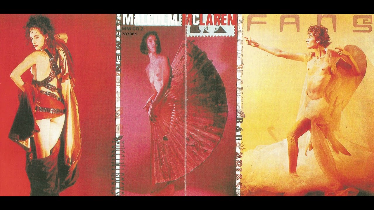
The success of Duck Rock overshadowed this album to a degree. Again Malcolm was so ahead of his time that, when we listen to it now we’ve heard variations of classical music mixed with electronic a lot. Malcolm played Vivienne Westwood, a country song by an artist we had been trying to develop called She Sheriff, Vivienne’s response was “she’d be better off singing the aria from Madame Butterfly”. That’s how it started. Malcolm and I went to an opera shop in Covent Garden and he bought a ton of records. He studied not just the music but the librettos too and in a few days he was an expert on opera.
Malcolm’s idea of a demo was to test it out in his fashion shows. We’d go to rehearsals and use Bernie’s 4 track recorder and crossover all these mad ideas, continuing with hip hop but electronic hip hop by Afrika Bambaataa and Special Request who had been influenced by bands like Kraftwerk, another brilliant idea. For the cover, I continued with my idea of making the front and back as the front. The girls representing the female characters in these operas, we added those name belts you could get in Times Square to modernise it. The lettering of the album title was in metallic gold.
Red Patent Leather – The New York Dolls (1984)
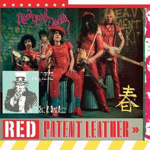
I sometimes forget I did this – another legendary band. This was listed as their 3rd official album but really it was a bootleg of their show at the Mercer Arts Centre. Worked with Marty Thau, the band’s manager and legendary photographer Bob Gruen on putting the cover together. The Chinese motif is from a Chinese takeaway menu for Egg Roll. People always thought it was some Maoist revolutionary slogan. This is a case of the cover being better than the record.
Biograph – Bob Dylan (1985)
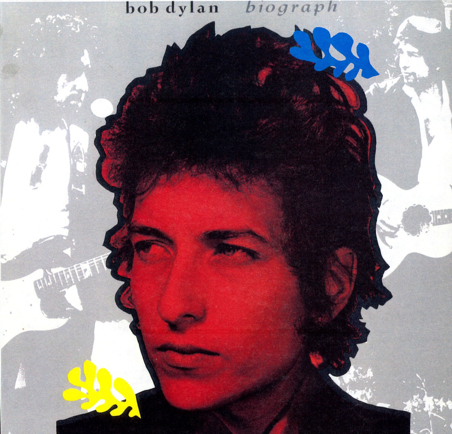
This was a truly special relationship with Bob and certainly one of the most unique artists I’ve worked with. So many great stories I could write a book just about him. When they asked me to do this special box set, I thought ‘How am I going to represent the career of Bob Dylan with one image?’. Especially when I went up to his publisher in New York and they dumped about 2000 photos on the table! But the moment I saw that publicity shot from the 1960’s I knew it was the one, it was very punk, his hair, it could have been Johnny Thunders. All I needed to do was update it a bit.
I loved the artwork of British artists Gilbert and George and the way they put primary colours over black and white photos was very contemporary at the time. There was also a Matisse exhibition of his jazz prints, which also had primary colours so I thought that would add to the poetic side of Dylan. Ghosted in the background were photos from the 70’s and 80’s so it covered the 3 decades Dylan had been around. The thrill for me was at the launch party for the record which was at New York’s prestigious Whitney Museum of Art where they had blown up giant pieces of the artwork displayed around the museum.
Blah! Blah! Blah! – Iggy Pop (1986)
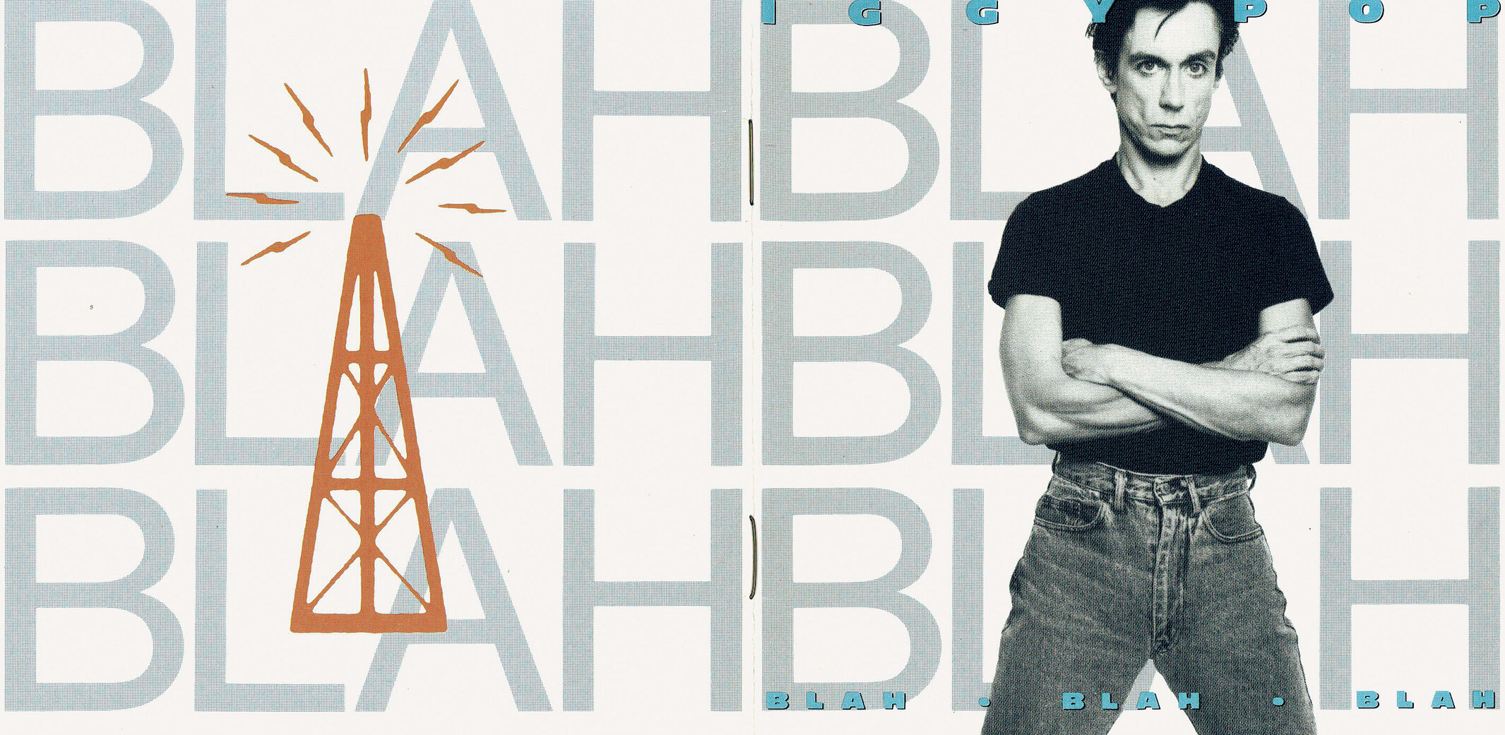
When I look back on things, I’ve had a great career having designed iconic album covers for some of the best artists of all time. But at the top of that list has to be Iggy Pop, even saying it sounds surreal. This was the beginning of my ‘clean look’. I had done collage style covers for nearly every cover I worked on. Iggy was perfect to start with this look because he had recently got clean from drugs (in particular heroin) and he was tanned and fit looking. So I thought we should treat this like it was a Calvin Klein ad, jeans and t-shirt, the classic ‘American’ look. At the time, the white cyc was popular in high fashion magazines like Italian Vogue.
I worked with photographer Michael Halsband who I met through Malcolm, Michael had shot Malcolm for GQ so he was perfect, he knew how to photograph men and still make them look masculine. My success up until then had made it possible to get that little extra out of the record label. In this case I wanted metallic silver lettering, which really pushes that style. It was great working with Iggy, he had an interesting way of thinking. I was over at his apartment on Broadway and Houston Street. He answered the door wearing a pinafore, a really flowery one, but it’s Iggy so it passes over you until I asked him something and he suddenly got up without saying anything and started manically vacuuming the floor. I wish I had a photo: Iggy Pop, the man who smeared his body with peanut butter and cut his chest with broken glass, in a yellowy floral pinafore vacuuming like he was the housemaid!
Book of Love – Book of Love (1986)
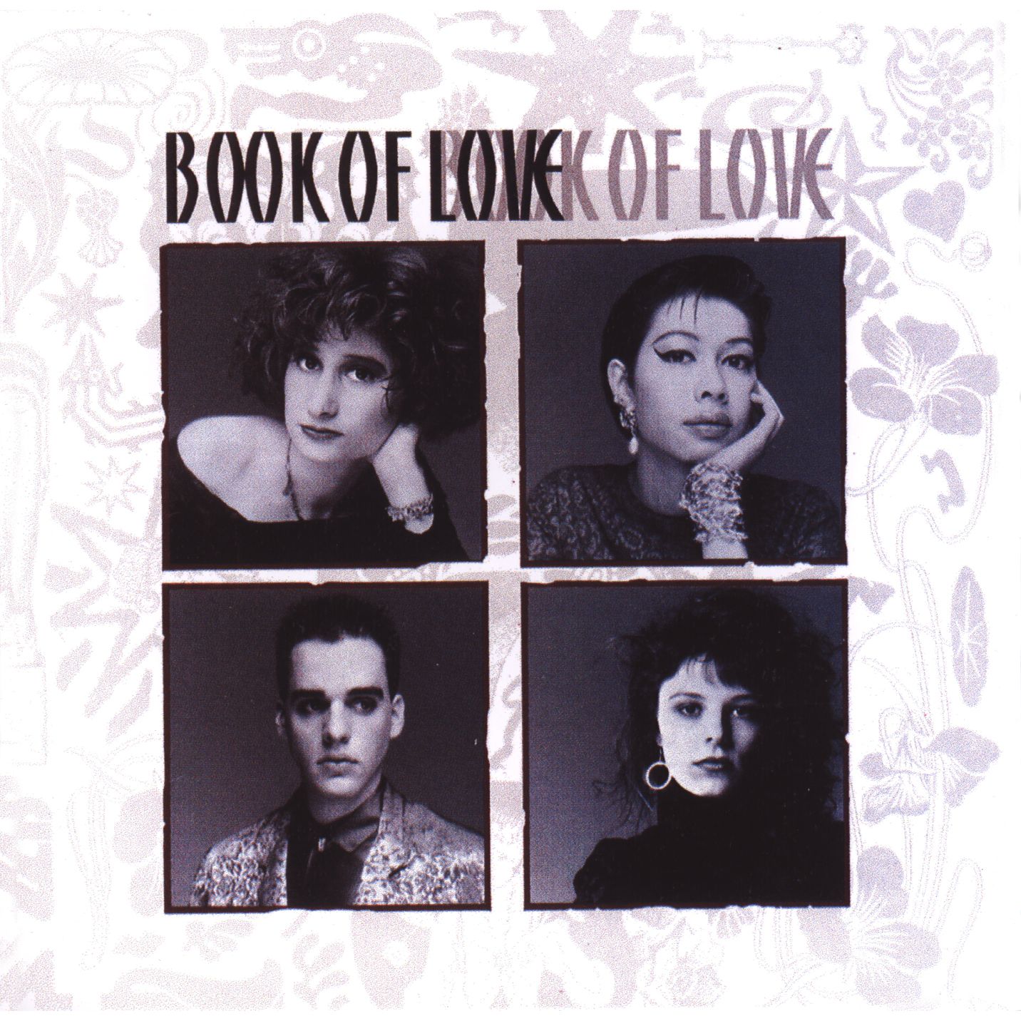
I really loved this band, one of the best electronica bands around, pre-EDM. They wrote great melodic dance songs but they really were the nicest and most appreciative people. They were like a family and went against type at the time with 3 girls and 1 boy. They sang about modern day relationships and how hard it was to keep together in New York, sweet on the surface but dark and twisted underneath. Again photographed by Michael Halsband.
Midnight to Midnight – Psychedelic Furs (1987)
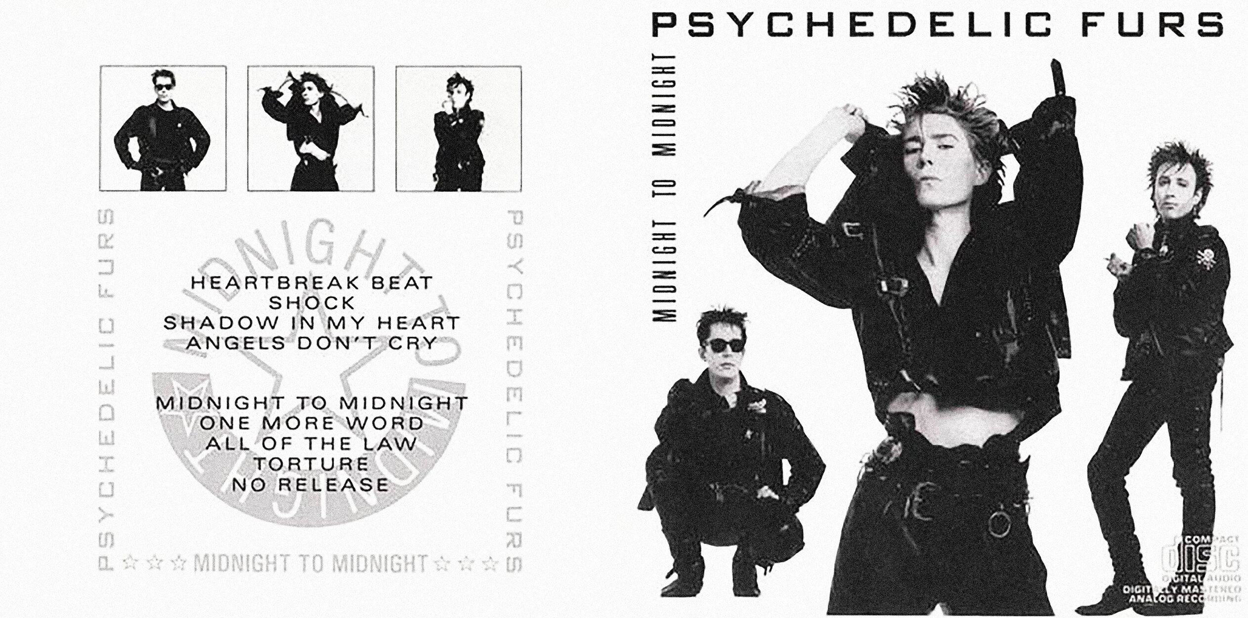
Continuing my clean, stylish, look. I discovered trying to shoot a band in a single photo is almost impossible as one band member always looks terrible. Trying to get them all to stand still in one place is like having young children, they can’t sit still for a second. Michael Halsband again did the shoot, he and I had a great collaborative partnership and he got everything exactly as I saw it. This was another special silver metallic ink package and the photo was duotone black and silver. I love Richard. He and I are still friends. He even came down to Devon and had dinner with my mum.
Further information
Coming soon: Part 2 of The Art of Sound will see Nick Egan collaborating with Michael Hutchence. Part 3 will provide Nick’s highlights from 1988 to 2015.