Photo by Mick Haupt on Unsplash
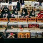
It’s easy to underplay the importance a band’s logo plays in their career. Naturally, the talent, music and songwriting have to resonate, but a logo can play an important accompanying role as a visual shorthand that depicts a band’s identity, style, and ethos in a simple graphic. Such symbols have been prevalent throughout rock history, from their iconic usage in the counter-culture rebellion of the 1960s through to the rock-laden thunder of the 1980s.
But a logo is much more than just a cool drawing that’s been creatively knocked together. Everything from style, to colours and font selection (if text is used) plays a part in creating something iconic. A rock band’s logo has to fit seamlessly into many different areas, from on-stage backdrops to t-shirts, websites, social media, and covers on physical media. A good logo is a real workhorse, but what makes one work?
High-Stakes Branding
The need for a powerful and yet versatile logo isn’t exclusive to the music scene, by any means. In any competitive industry, from motor cars to clothing and even online gambling, a logo serves as a friendly handshake between the particular brand’s desire to build a connection with an audience. But they can also serve different purposes in different industries. A rock fan will look for logos to wear to show their fandom, while users browsing curated lists of British online casinos, such as those published by experts at Legalbet.uk, can see how professional logos are used to instill trust. The online casinos industry is extremely competitive, and operators that produce versatile, instantly recognisable logos that work on mobile apps, desktop browsers, and in advertisements helps a casino stand out in a saturated market and gain reputation. But what makes a rock band’s logo stick?
A Look Back Through Time
Most people can relate to the Rolling Stones’ “Tongue and Lips” logo, which was designed by John Pasche in the 1970s. It’s powerful, seductive, and without any textual context, people know exactly whose logo it is. It’s also a great example of being more than just a logo; it’s a reflection of lead singer Mick Jagger’s image and the band’s in-your-face anti-authoritarian style.
Another great example is AC/DC’s lighting bolt. People see a lightning bolt and immediately connect that with something that is high-energy, which fits perfectly with the band’s music. The same with The Who’s target logo, which tapped into Pop Art and tied them into the Mod movement, while Metallica’s name logo is bracketed by sharp-edged lettering, which is like a badge of honour for the band’s style.
Work Across the Media
Iconic rock logos like the aforementioned ones work because they can be taken out of isolation. A logo that looks fantastic emblazoned on a t-shirt could end up being illegible when reduced down to small branding on a social media post, for example. That would make it a misfire, as the design must check the boxes across three key areas:
Merchandise
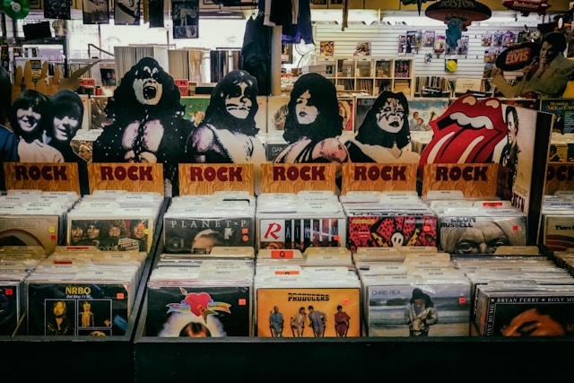
Gig and festival goers are always going to snap up merch, and that makes the most successful logos “wearable”, which, in general, means that they should be kept clean and simple, as anything too intricate is likely to lose all impact when printed on a shirt. The Ramones perfectly nailed the balance with their circular, seal of approval logo, as it looks equally fantastic on t-shirts as it does on vinyl. Given that merchandise can range from badges to sew-on patches, to t-shirts and bags, logos simply can’t afford to fail in this area.
Posters and Advertising
Think of a tour poster going up outside of a concert hall. The first thing a band wants seen is their logo and name. It therefore must be eligible enough to stand out against poster backdrops (as well as album sleeves, and CD covers), which are typically bright and dynamic themselves. But whether it is something psychedelic or something with a gritty, black and white urban feel, the logo can’t get lost in all of that, whether it’s physical or digital sizing formats.
On Stage
Where do you most commonly see a band’s logo when watching a show? It’s on the backdrop and the drum kit. In the case of the former, logos have to be grossly enlarged and translated onto backdrops for the gig, whether that’s in a digital format or as a complicated lighting rig hanging above the stage. A logo with a strong silhouette will help it stand out across a broad range of concert lighting.
Part of the Show
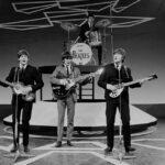
Nirvana had their unpolished smiley face that highlighted their raw, anti-corporate sound, Pink Floyd had the famous prism image, and although it wasn’t their official logo, it became synonymous with the band, while the Beatles had their Drop-T typography, all great examples of less-is-more.
A good rock band logo does a lot more than just get stuck on the corner of an album cover. It acts as a visual anthem that unites fans and evokes feelings of excitement and anticipation of what’s to come when the visual and audio sides of the music industry are bridged.